ABOUT THE PROJECT
Relief Bite
Relief Bite
Relief Bite is an app design project centered around improving the food and grocery experience for those living with food allergies. Millions of people in the US have food allergies and a majority of them feel shopping and eating could be easier.
This project was done with four teammates during my time at the Savannah College of Art and Design. We went through a long research phase to fully understand the problem and target audience in order to create an app with a seamless user experience that could assist in easier food experiences for those with allergies.
ROLE
UI/UX Design
DATE
2024
TEAM
Wade Traylor
Laura Westmark
Endia Jenkins
Malia Campbell
Navione White
01
The Problem
The Problem
Problem
Problem
Millions of people with food allergies have a hard time dealing with food-related issues regarding ingredients and finding foods that they can eat.
Millions of people with food allergies have a hard time dealing with food-related issues regarding ingredients and finding foods that they can eat.
Solution
Solution
Give easily accessible and tailored information on the go. Having the information needed to know what products are friendly to their specific allergies along with what grocery stores will help them whether in the middle of shopping, or just browsing for a new snack!
Give easily accessible and tailored information on the go. Having the information needed to know what products are friendly to their specific allergies along with what grocery stores will help them whether in the middle of shopping, or just browsing for a new snack!
02
Research
Research
Competitor Research Snippet
Products Researched:

Key Takeaways
Cater all experiences towards the user's specific allergy needs
Ensure variety of foods for all different types of allergies
Be accessible and clear for all types of people to be able to use

Key Takeaways
Community features can connect allergy users together
Symptom trackers can help give users piece of mind with allergies
Users can post different recipes and reviews to help others
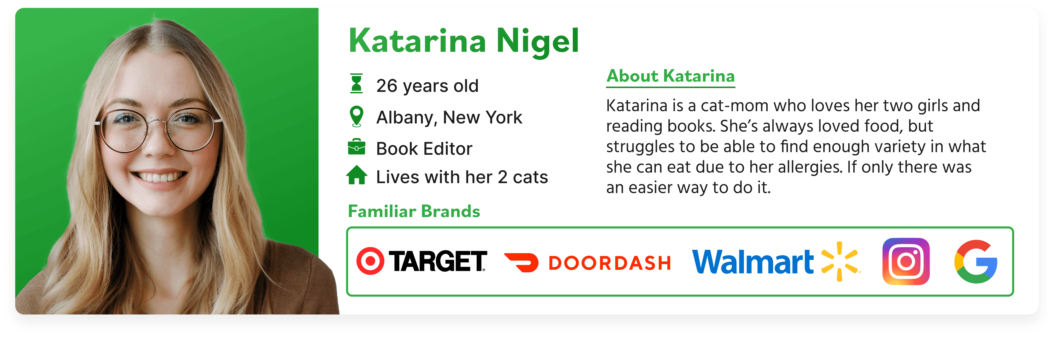
Empathize & Understand
To better understand the user's point of view, our team conducted interviews, created user personas, user journeys, and user flows. We also utilized card sorting in order to understand how those with allergies related different navigation points to best cater to them with the user experience.
To better understand the user's point of view, our team conducted interviews, created user personas, user journeys, and user flows. We also utilized card sorting in order to understand how those with allergies related different navigation points to best cater to them with the user experience.
To better understand the user's point of view, our team conducted interviews, created user personas, user journeys, and user flows. We also utilized card sorting in order to understand how those with allergies related different navigation points to best cater to them with the user experience.
To better understand the user's point of view, our team conducted interviews, created user personas, user journeys, and user flows. We also utilized card sorting in order to understand how those with allergies related different navigation points to best cater to them with the user experience.

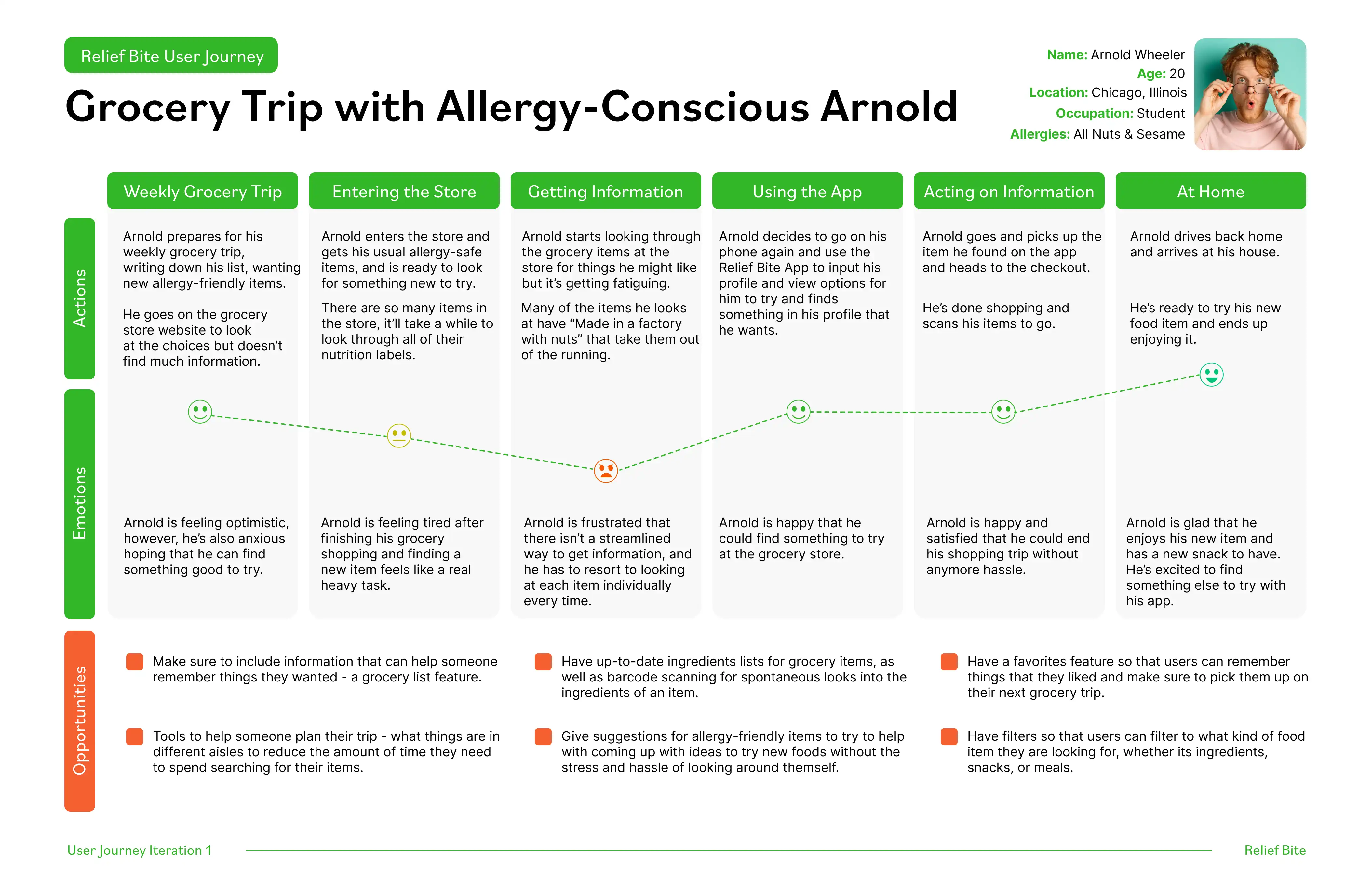
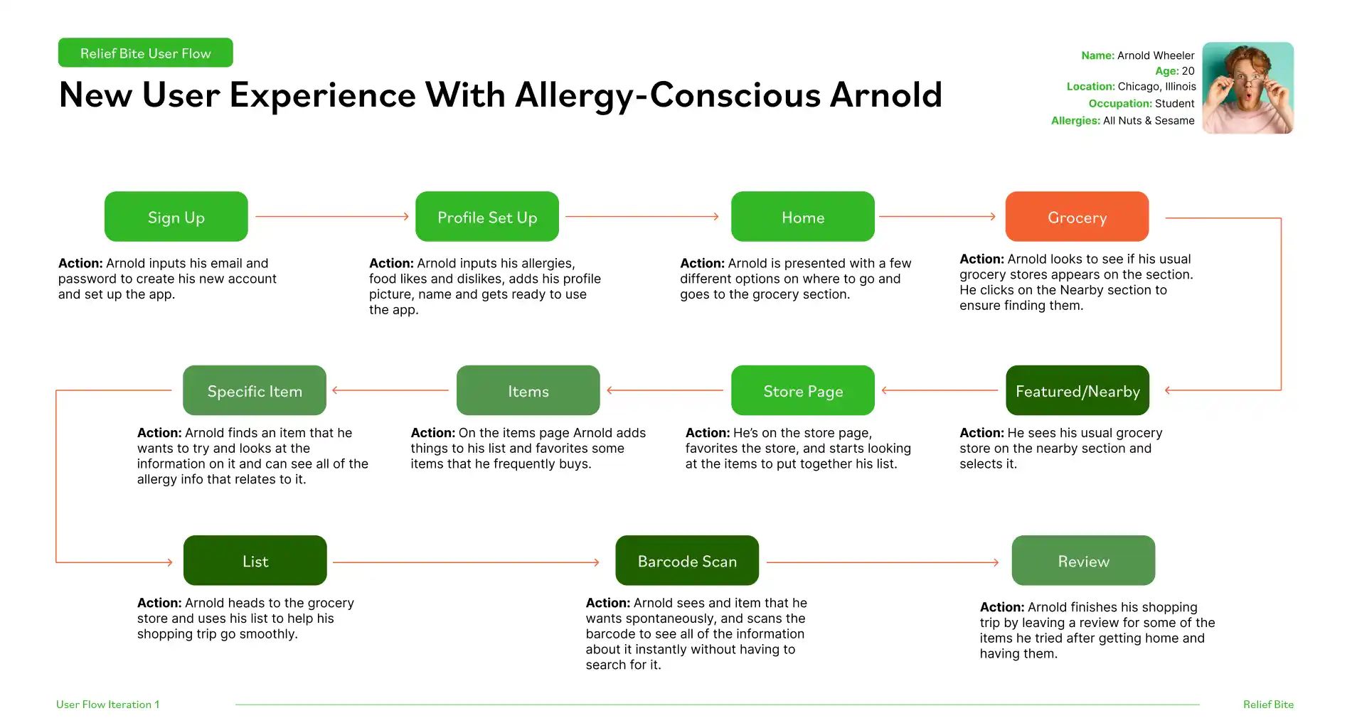

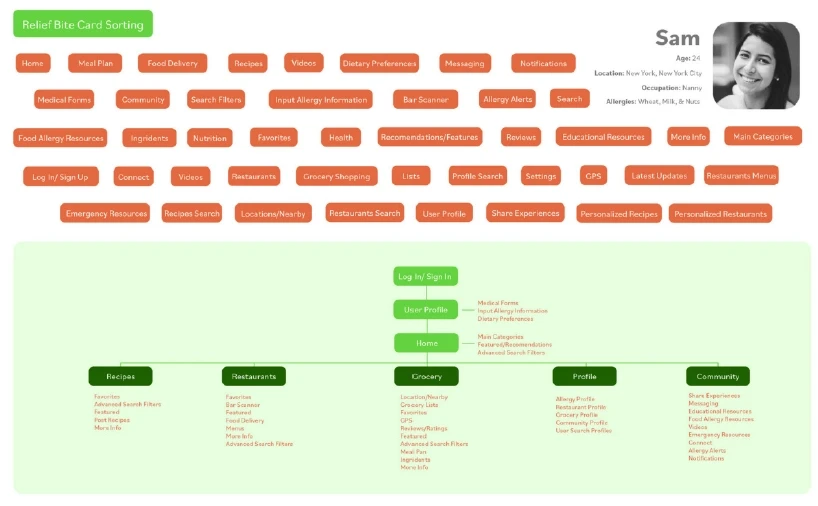
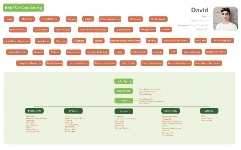
Key Research Takeaways
User Journeys revealed the likelihood of users using the app mid-grocery shop and sparked the idea of a bar code scanner.
User flows and card sorting exercises ironed out the navigation and gave us distinct sections: Grocery (My Responsibility), Restaurant, Recipes, and Community.
The user interviews gave us a direct insight into the lives of the audience and let us know how the app could come into play in their life.
03
Ideation
Ideation
Wireframes
When wireframing the grocery section, I thought about the most important aspects I found from my research:
Keep information easily accessible for use while grocery shopping
Include features that will help during grocery trips
List & favorites features help those with allergies quickly remember things that don't upset their allergies
Reviews let others know intricacies related to certain allergies

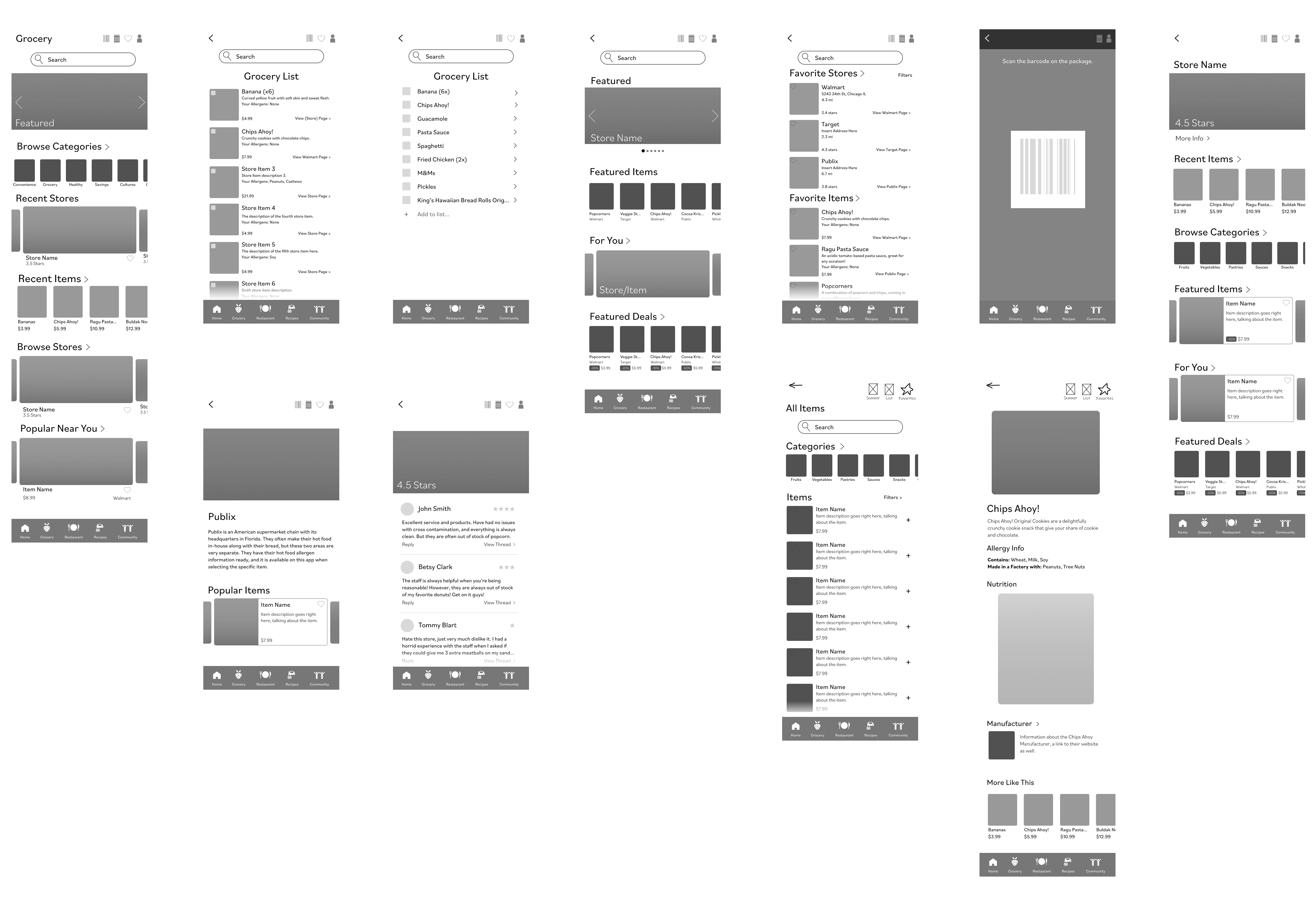
Research Based Decisions
Keeping in mind the above aspects, I decided to use small card systems to organize the grocery section and make things very clear and usable. Labels on food items and on grocery stores noting if it was compliant with the user's allergies were added as well for quick use while in the grocery store. A bar-code scanning feature was also added to easily search products at the grocery store for their ingredients.
Keeping in mind the above aspects, I decided to use small card systems to organize the grocery section and make things very clear and usable. Labels on food items and on grocery stores noting if it was compliant with the user's allergies were added as well for quick use while in the grocery store. A bar-code scanning feature was also added to easily search products at the grocery store for their ingredients.
Keeping in mind the above aspects, I decided to use small card systems to organize the grocery section and make things very clear and usable. Labels on food items and on grocery stores noting if it was compliant with the user's allergies were added as well for quick use while in the grocery store. A bar-code scanning feature was also added to easily search products at the grocery store for their ingredients.
Keeping in mind the above aspects, I decided to use small card systems to organize the grocery section and make things very clear and usable. Labels on food items and on grocery stores noting if it was compliant with the user's allergies were added as well for quick use while in the grocery store. A bar-code scanning feature was also added to easily search products at the grocery store for their ingredients.
04
Final Deliverables
Final Deliverables
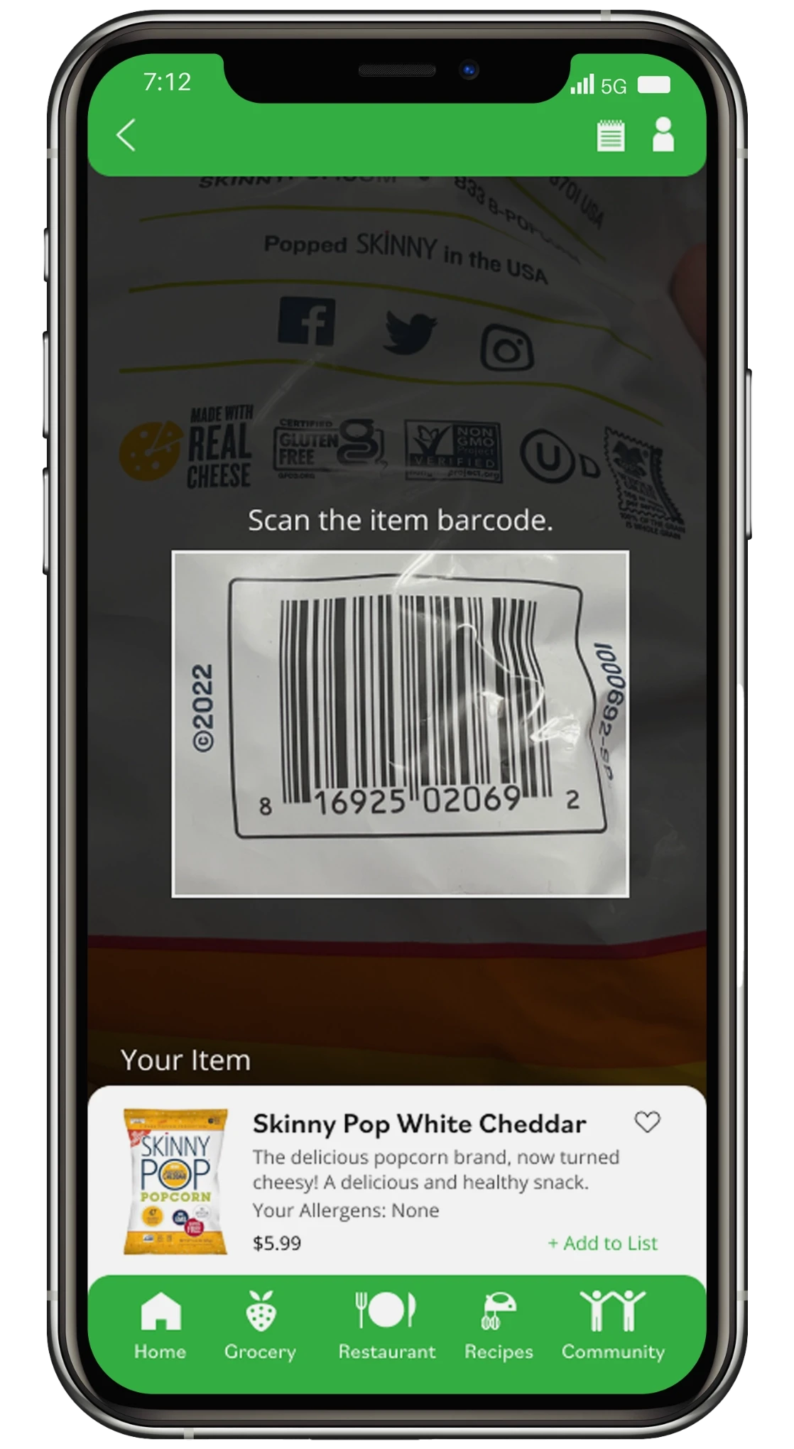
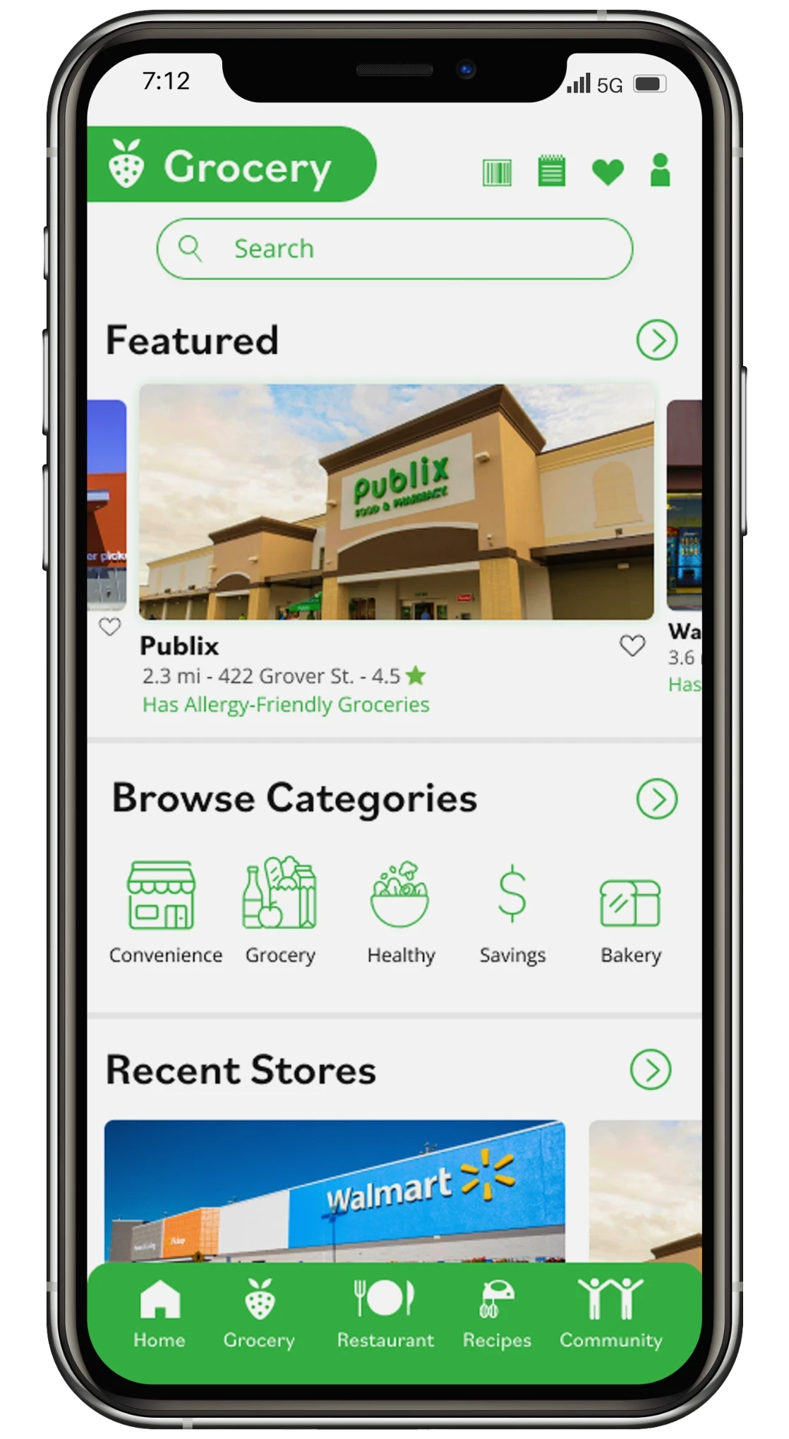
App User Interface
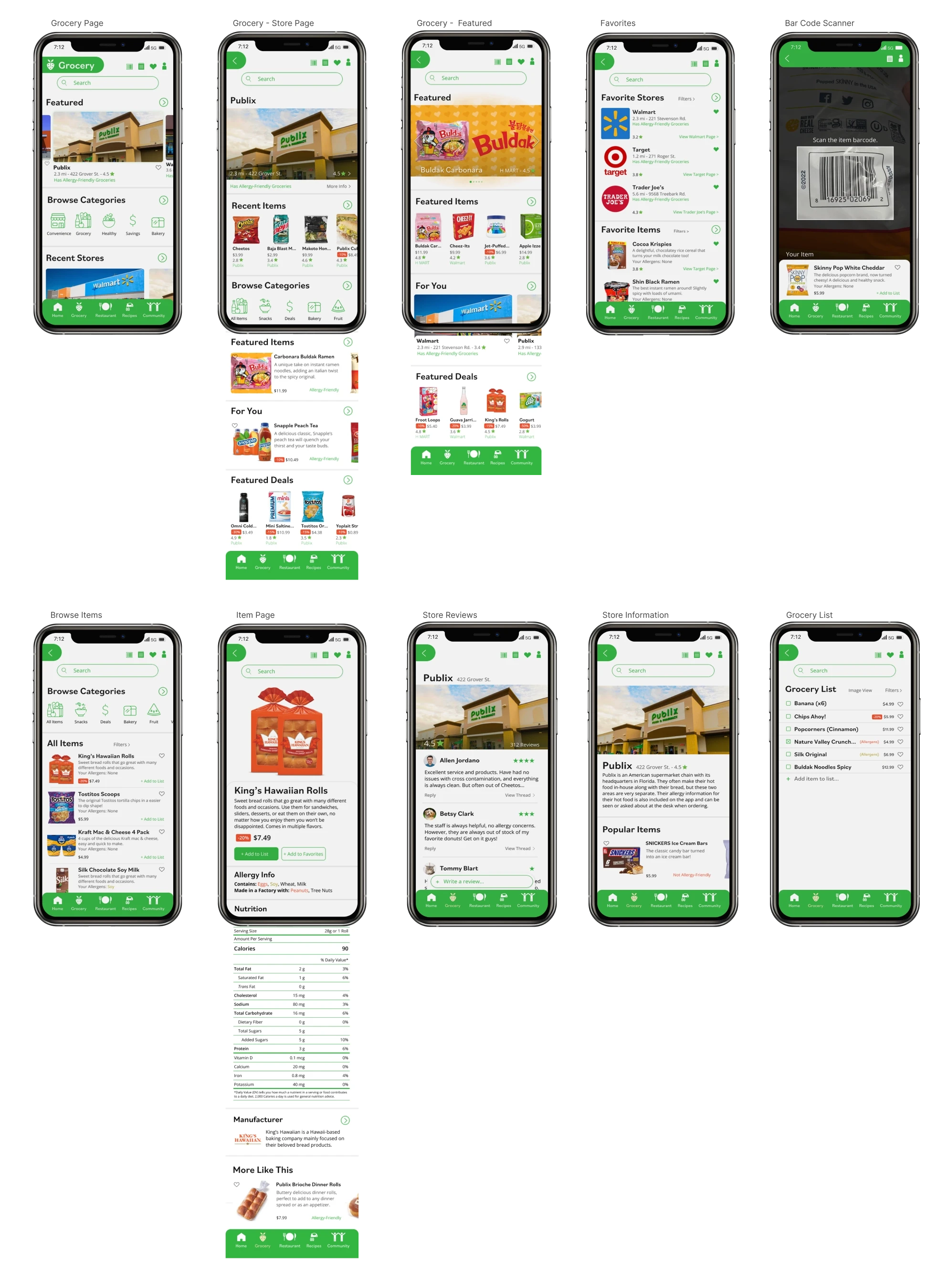
The key aspects of the final screens:
Clear allergen information in labels underneath each grocery item
Quickly accessible grocery information through barcode scanner & search bar
Clean & modern design aesthetic for accessibility and usability
Recent items shown first on store pages for easy location in case of a reaction to a specific food item that was recently purchased
The user research greatly assisted our team in crafting the final deliverables. For the grocery section it went a long way in deciding the hierarchy of information and how to section and label all of the items.
Our team decided on a modern design due to the clarity and the aesthetic of helping the user to feel "clean" on a health-related app. This along with the main green color gives the right vibe. The orange secondary addition is great for contrast and is also commonly associated with hunger and food to round out the color palette and app theme.
Editable Components
Fully editable components for ease of building new layouts in figma.